Adding Radio buttons
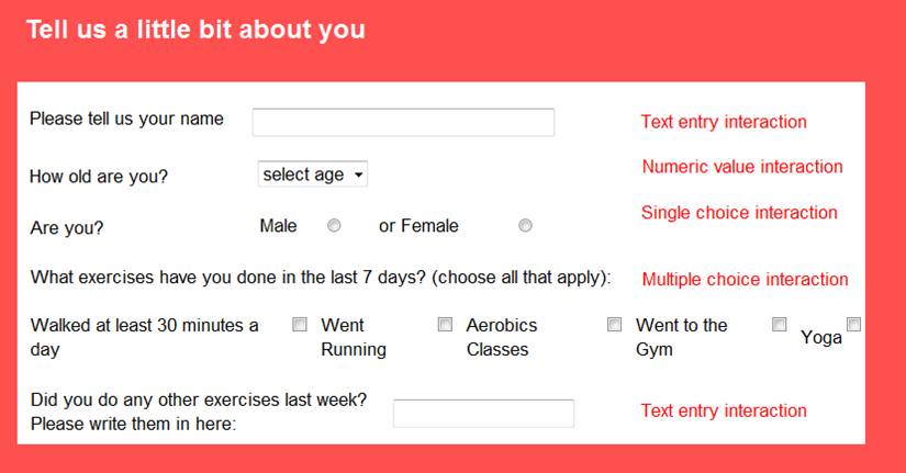
Single choice interactions allow your end-user to select only one of the presented responses and are used when you require only one response from an interaction (e.g. if you ask the end-user to select if they are male or female).
Multiple choice interactions allow you to choose how many options end-users can select from an interaction and are used when you want them to select a number of response options (e.g. selecting all of the different types of exercise that they have done over the last week).
Single choice interactions will use circle checkboxes, and multiple choice interactions will use square checkboxes.
Single/Multiple choice interactions are set to single choice by default. Change it to a multiple choice interaction by adjusting the number of maximum choices.
By default, the response labels (e.g. male, female) for the interaction will be displayed vertically and to the left of the interaction checkboxes. Change this layout by checking the corresponding Layout options.
You can change the size of your single/multiple choice interaction buttons by selecting the use bigger buttons option from the interaction properties menu. NB There are some bugs associated with the use of bigger buttons and we recommend that you use the regular sized radio buttons until the bugs are fixed.
Edit the responses that will be presented to end-users by clicking on Edit Responses. As usual in LifeGuide the responses will need their own unique names.
